Strand
A visual system that speaks softly but confidently, mirroring this medtech startup's blend of scientific intelligence and human care.
Brand Design
Brand Strategy
Naming
Communications
Strand is a pioneering healthcare startup operating at the frontier of AI-driven genetic medicine. Their mission is ambitious: to harness advanced sequencing technologies and machine-learning models to create hyper-tailored therapeutic pathways for individual patients. They had a breakthrough technology and a bold vision, but needed a brand that could translate their scientific advancement into something relatable, reassuring, and deeply human.
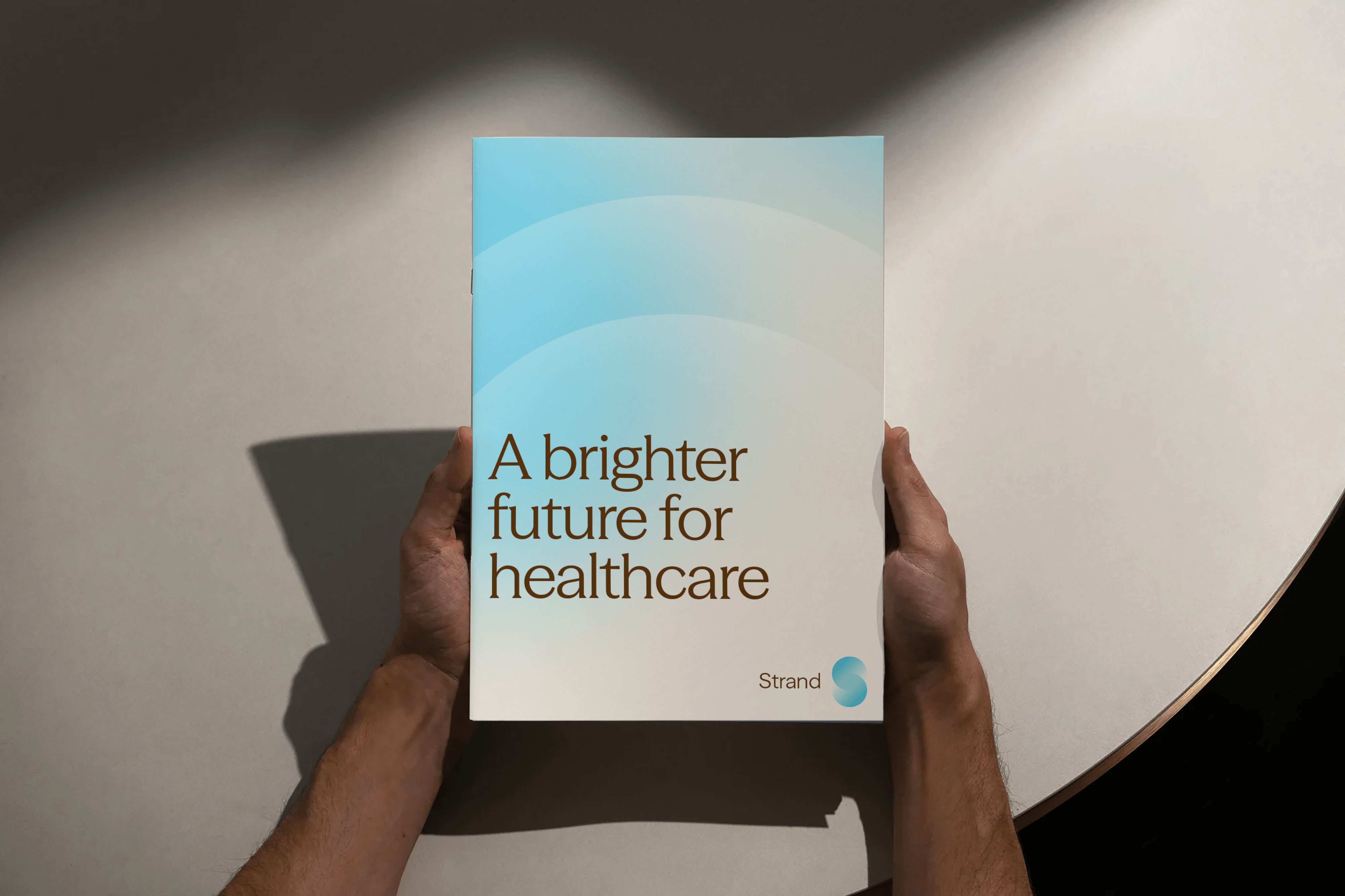

Born of the double helix
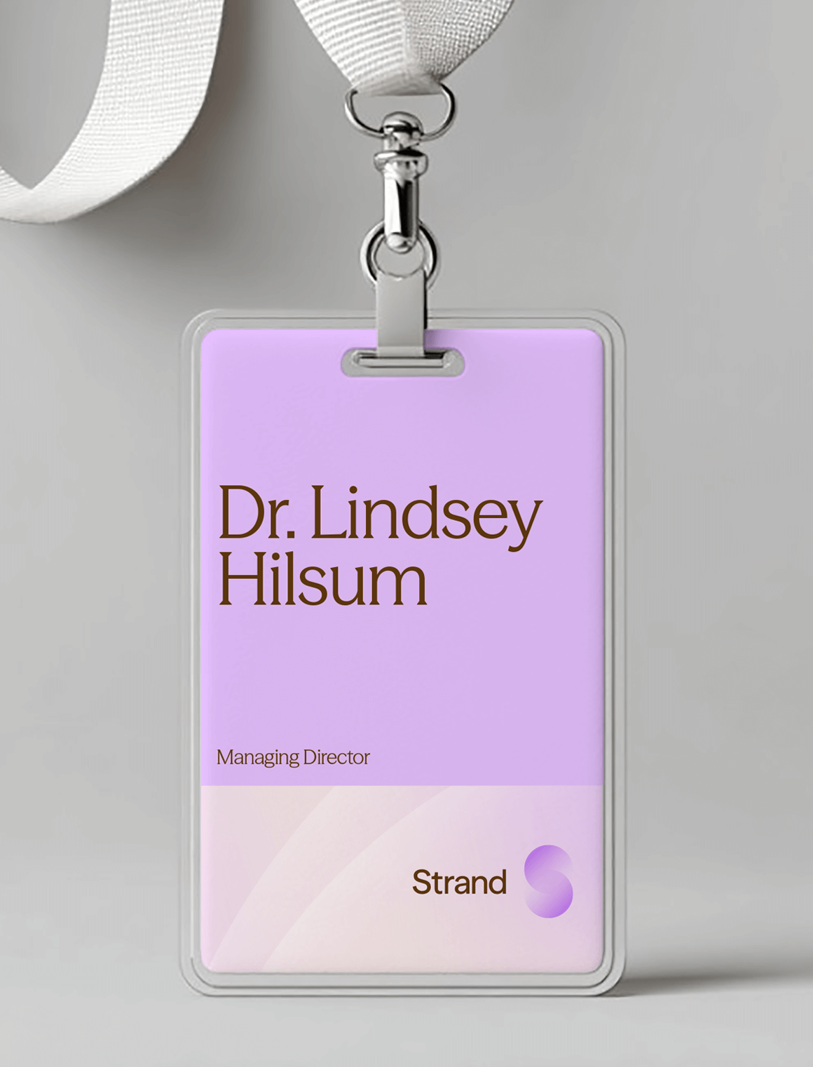
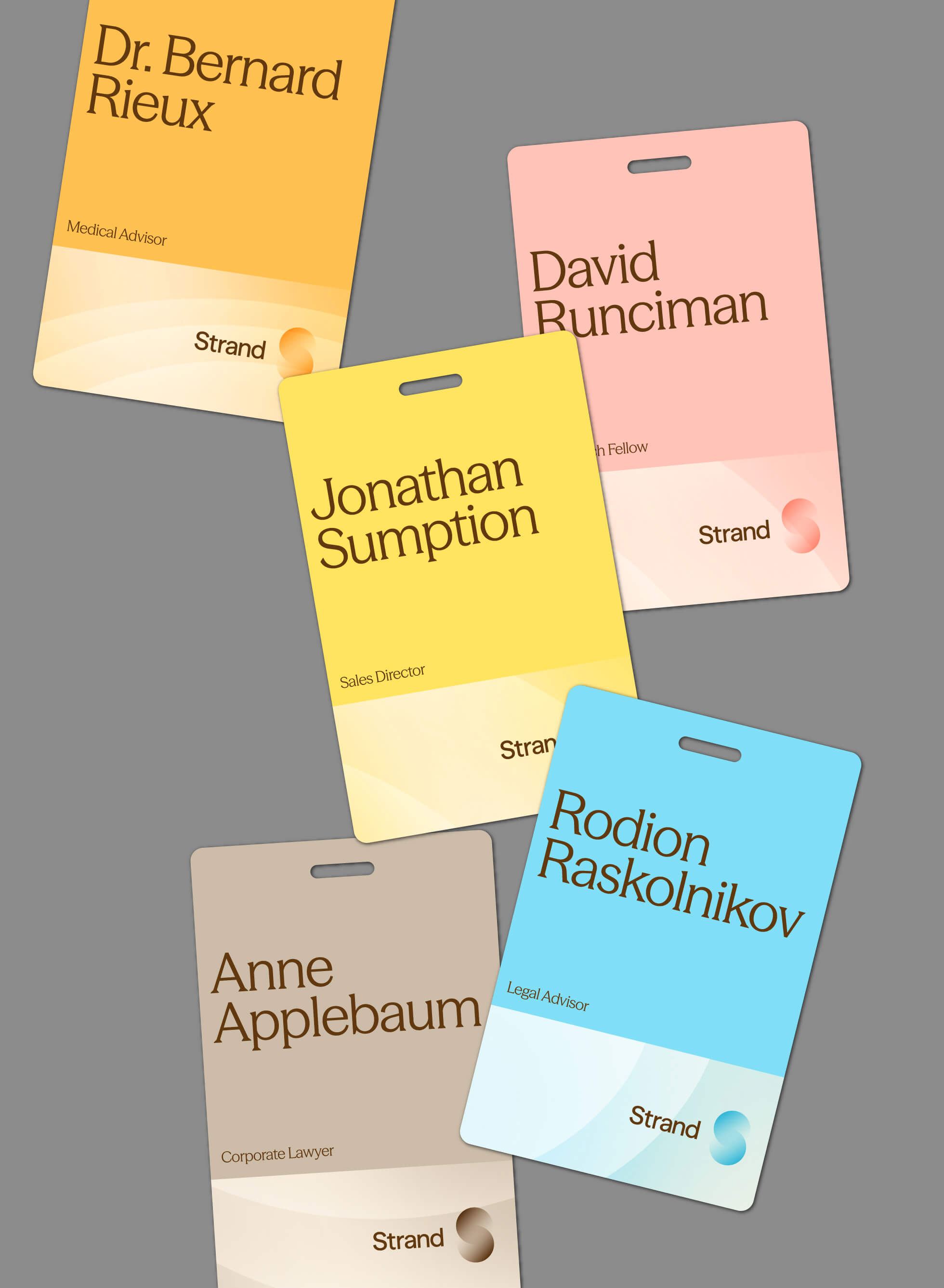
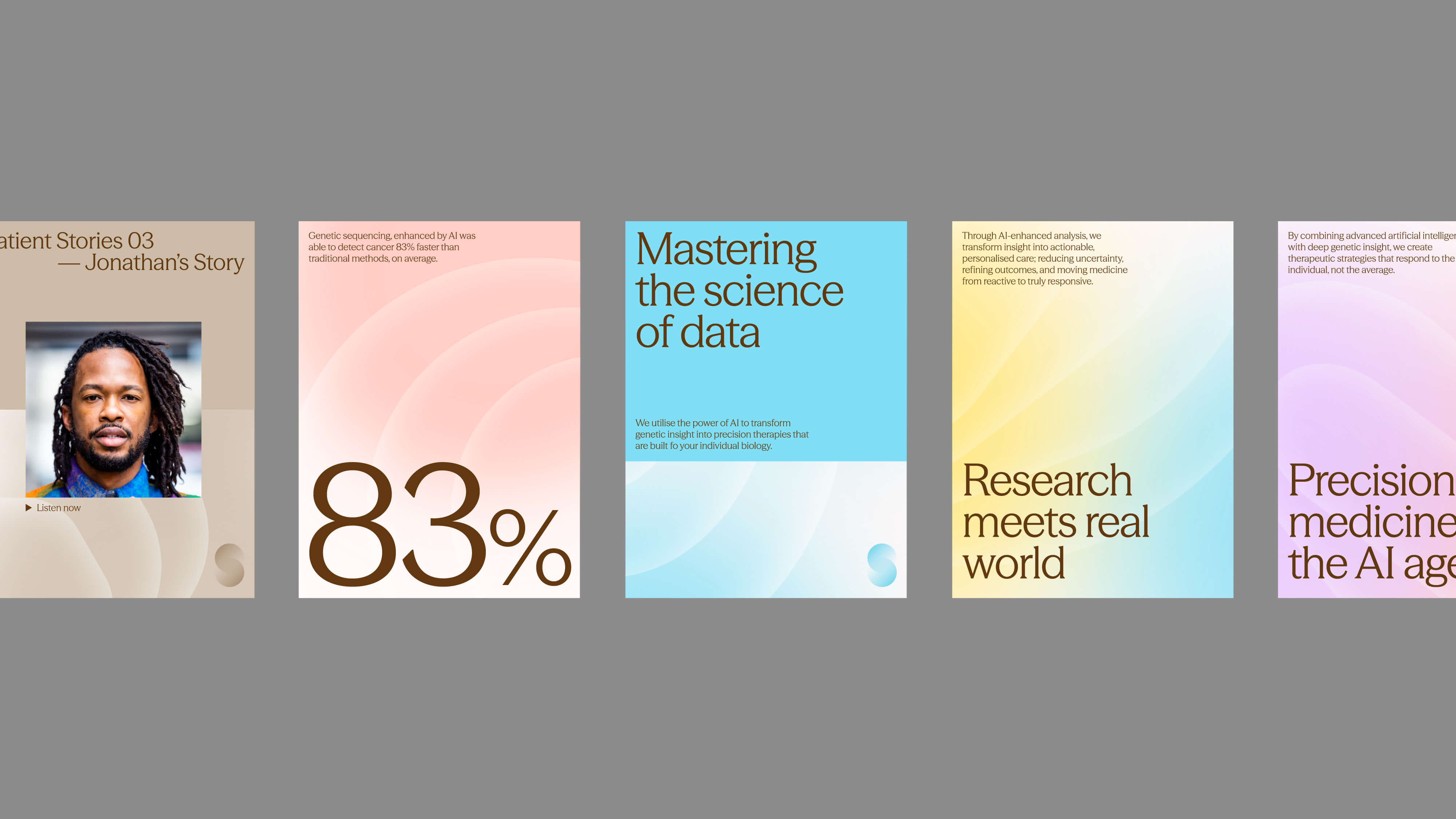
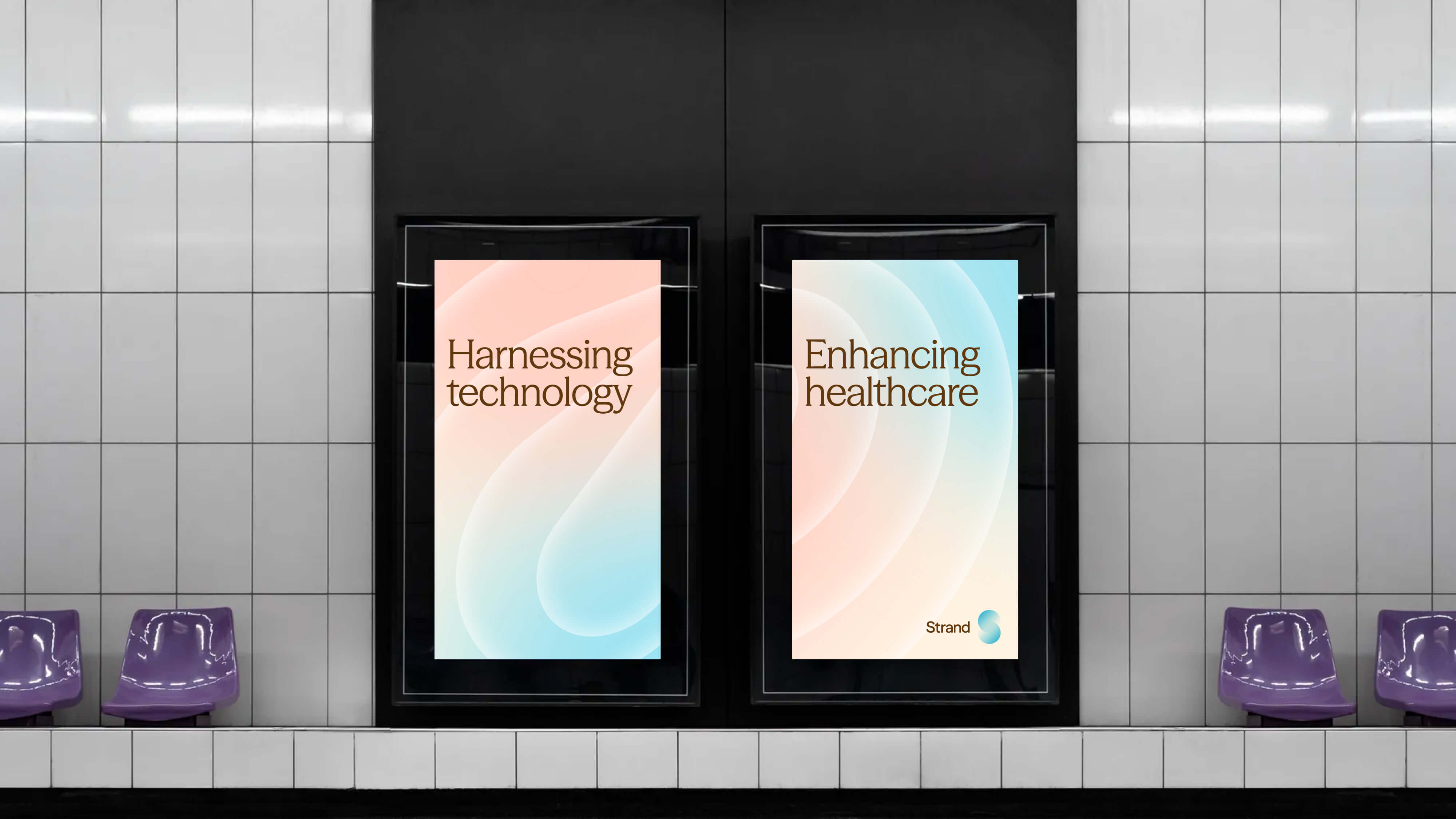
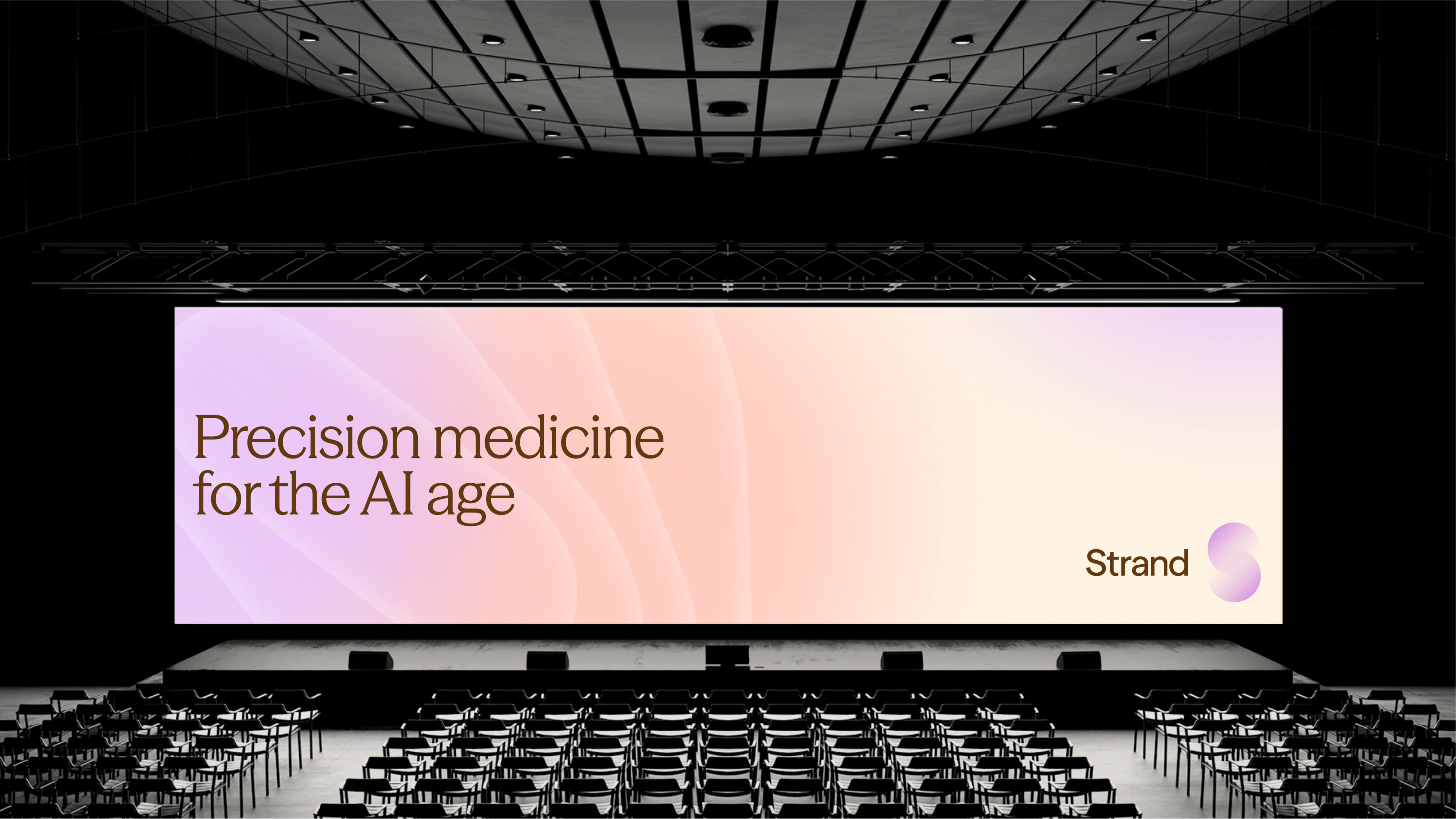
The name Strand evokes the intertwined spirals of DNA — the most fundamental expression of human individuality. The brand is built around this idea, developing a visual language inspired by the fluid, interwoven forms of the double helix. These soft, looping strands became the foundation of the logo, a mark that signals both scientific precision and human connection.
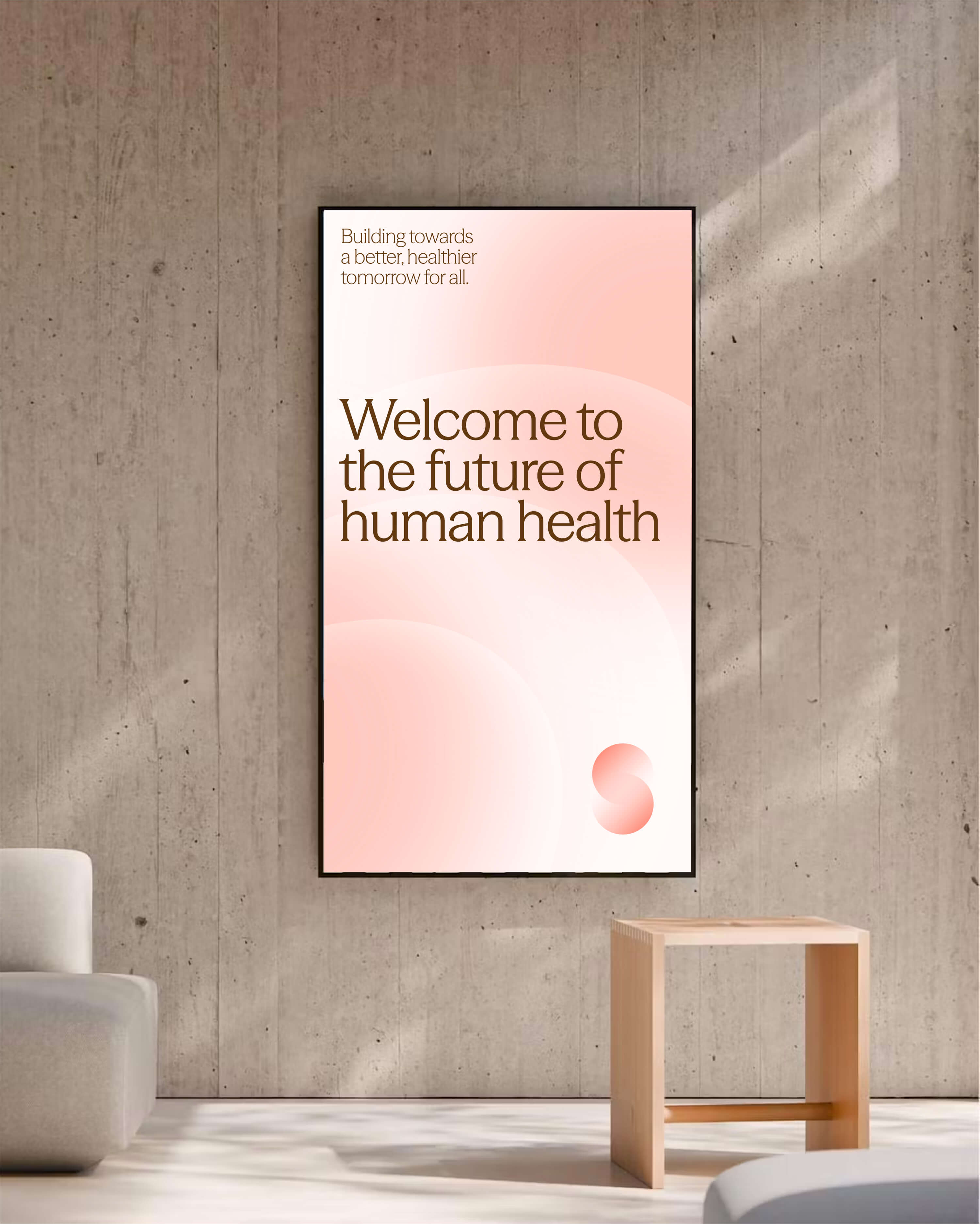
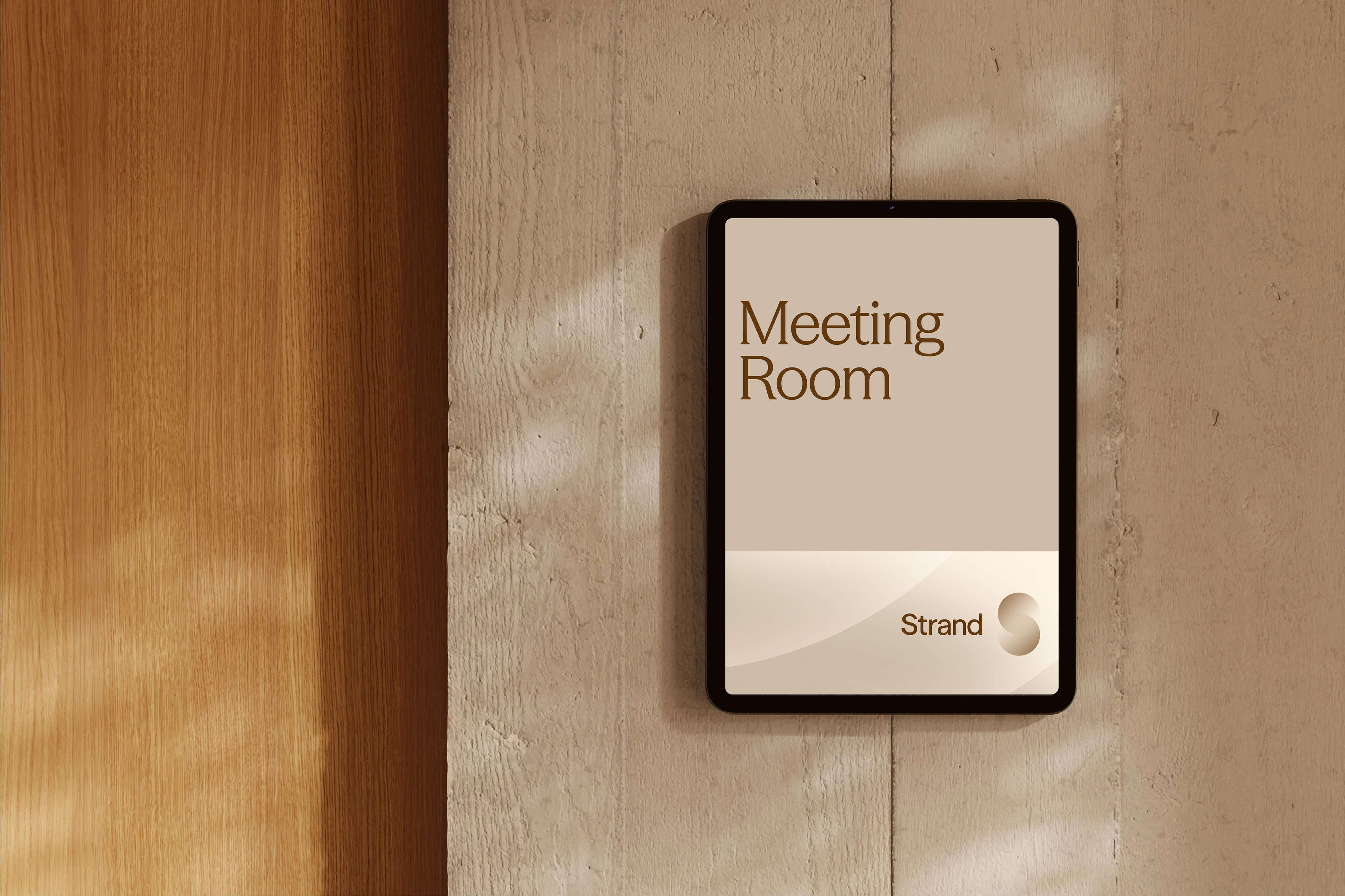
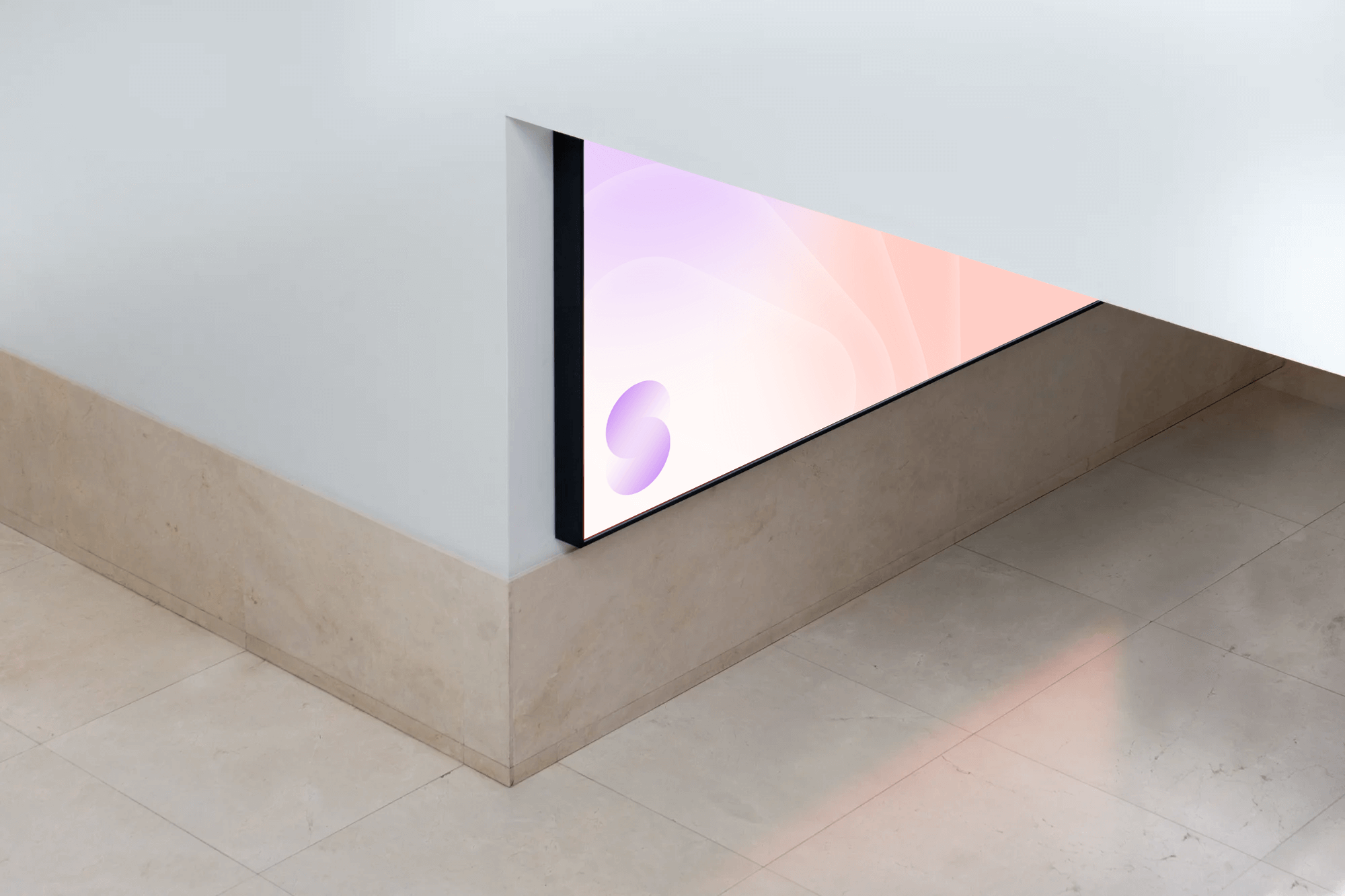
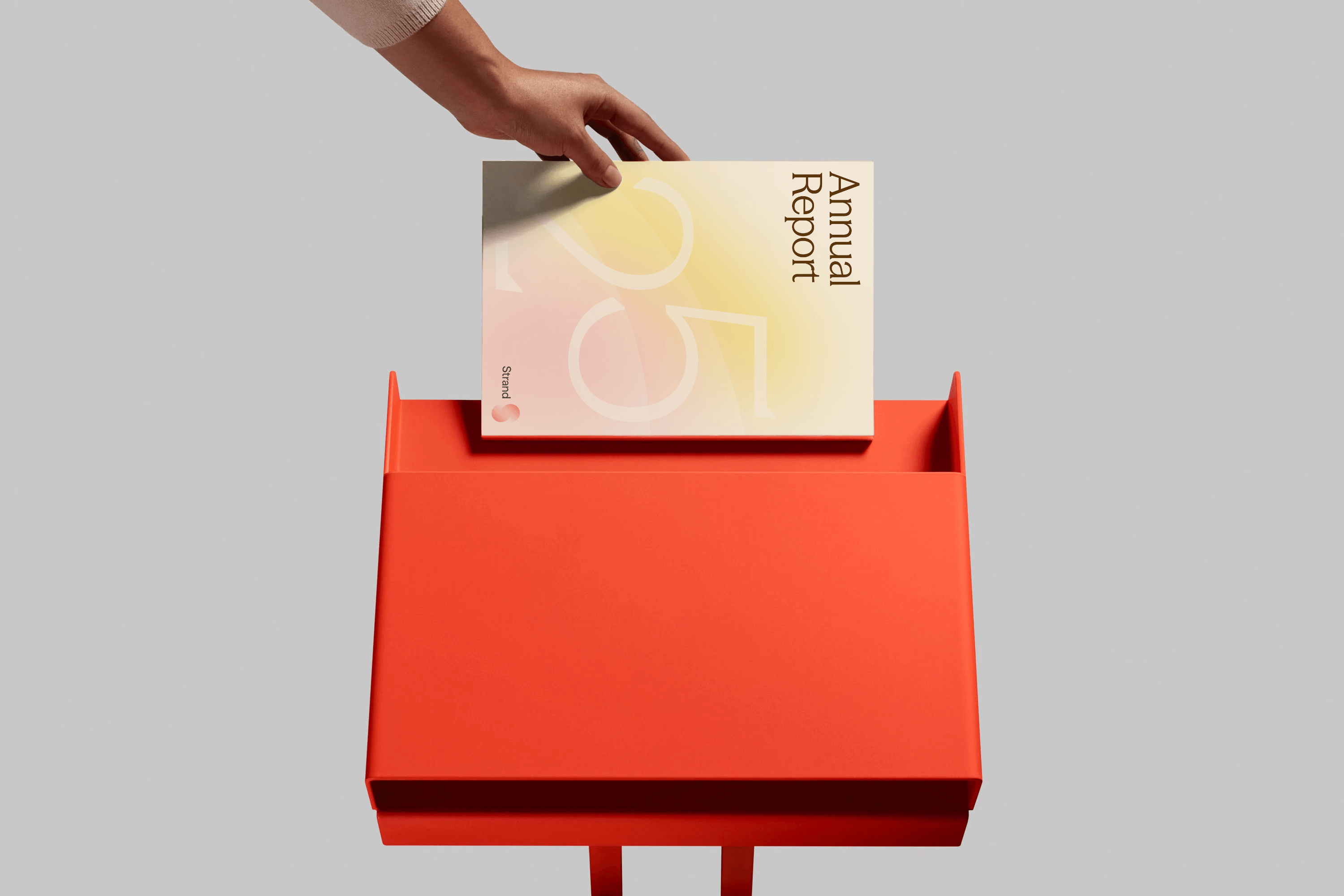
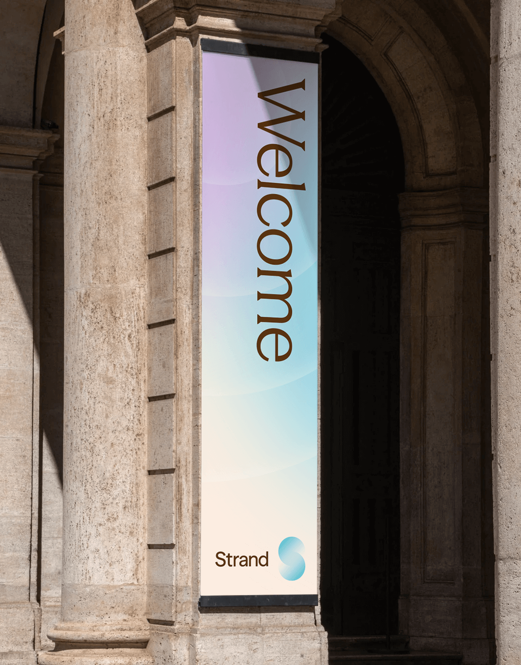
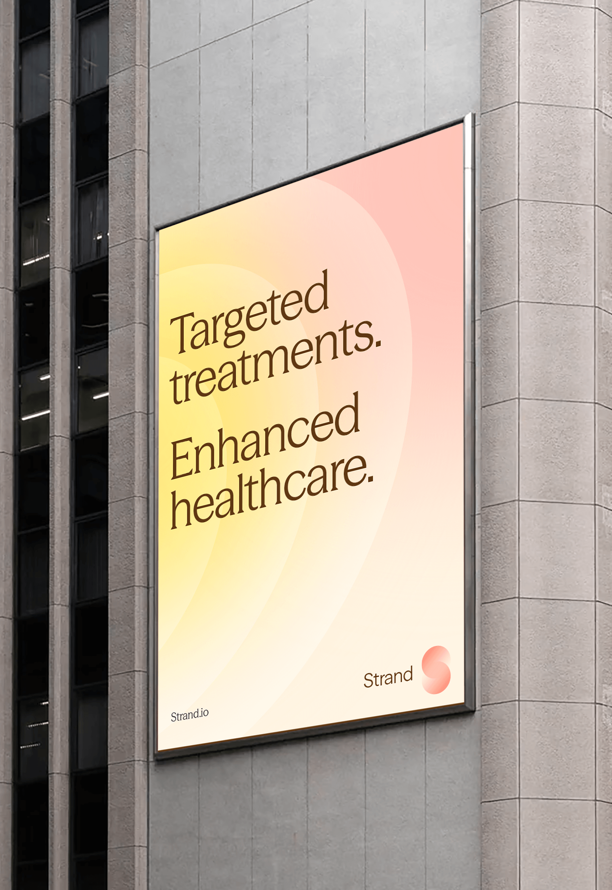
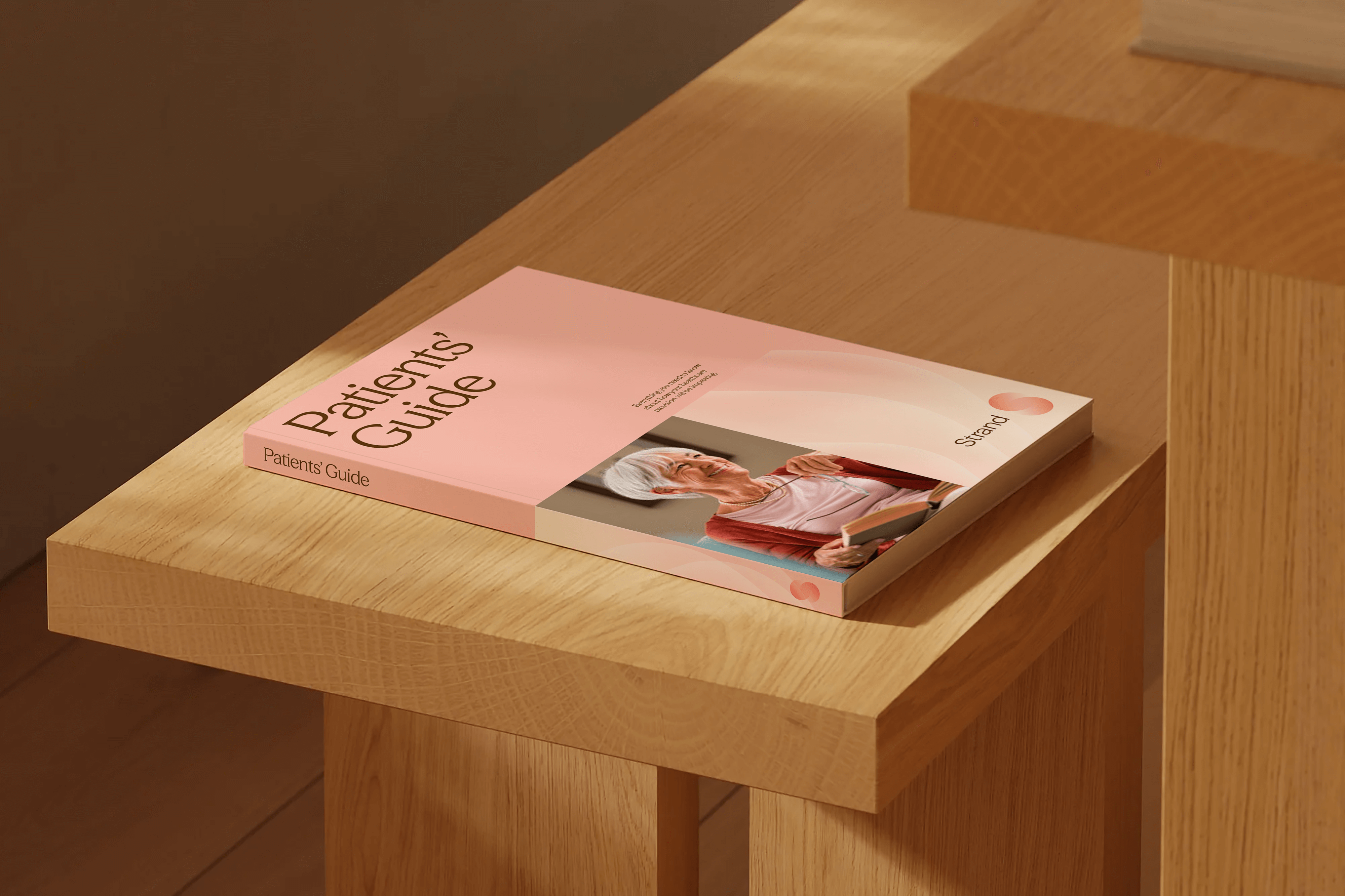
Subtle gradients bring warmth and dimensionality to the system, shifting gently between tones to suggest movement, evolution, and biological rhythms. While the palette remains contemporary and restrained, its softness offers a fresh alternative to the neutral approach often associated with high-tech healthcare.
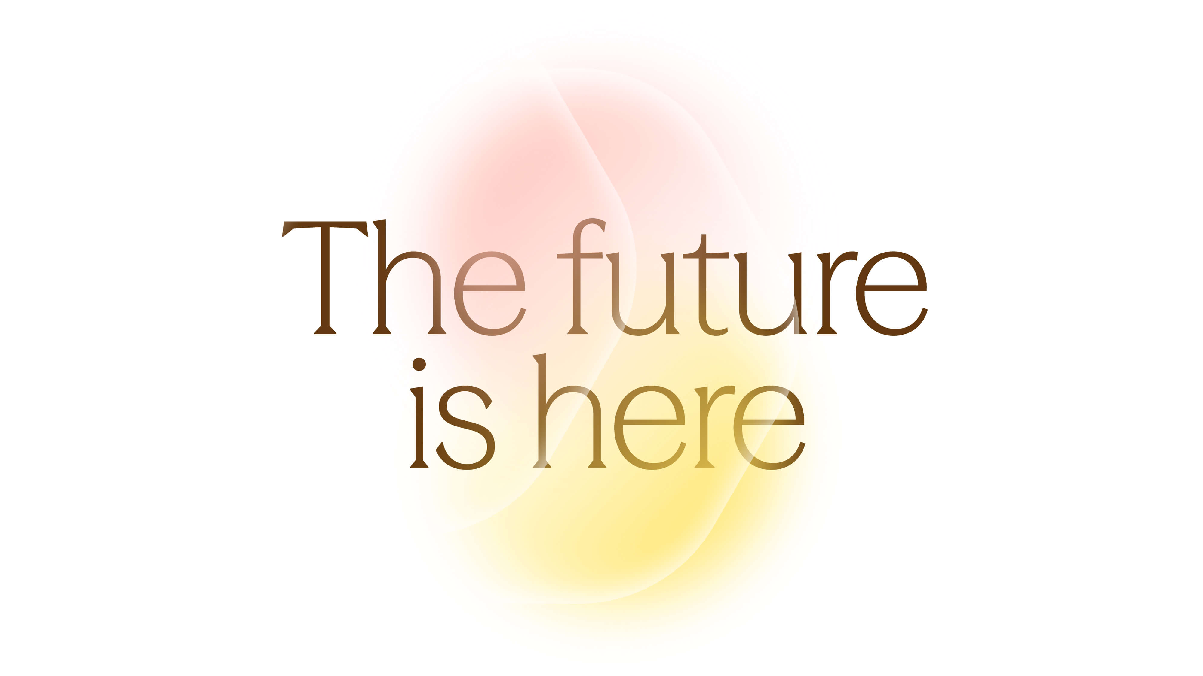
To complement these organic elements, the chosen typeface is a contemporary serif (Season Mix by Displaay); refined but approachable. Its humanistic proportions add warmth into the brand’s voice, grounding cutting-edge innovation in trust, care, and clarity.


Credits
Designed at Freelance
Creative Direction & Design:
Kieron Farrell
Font:
Season Mix and Season Sans by Displaay
Related Work

Virtual Treasury

The Interface

Larsen /Pau