Agentic
A bold and minimal visual identity for a Web3 gallery.
Brand Strategy
Brand Design
Naming
Website Design
Motion Design
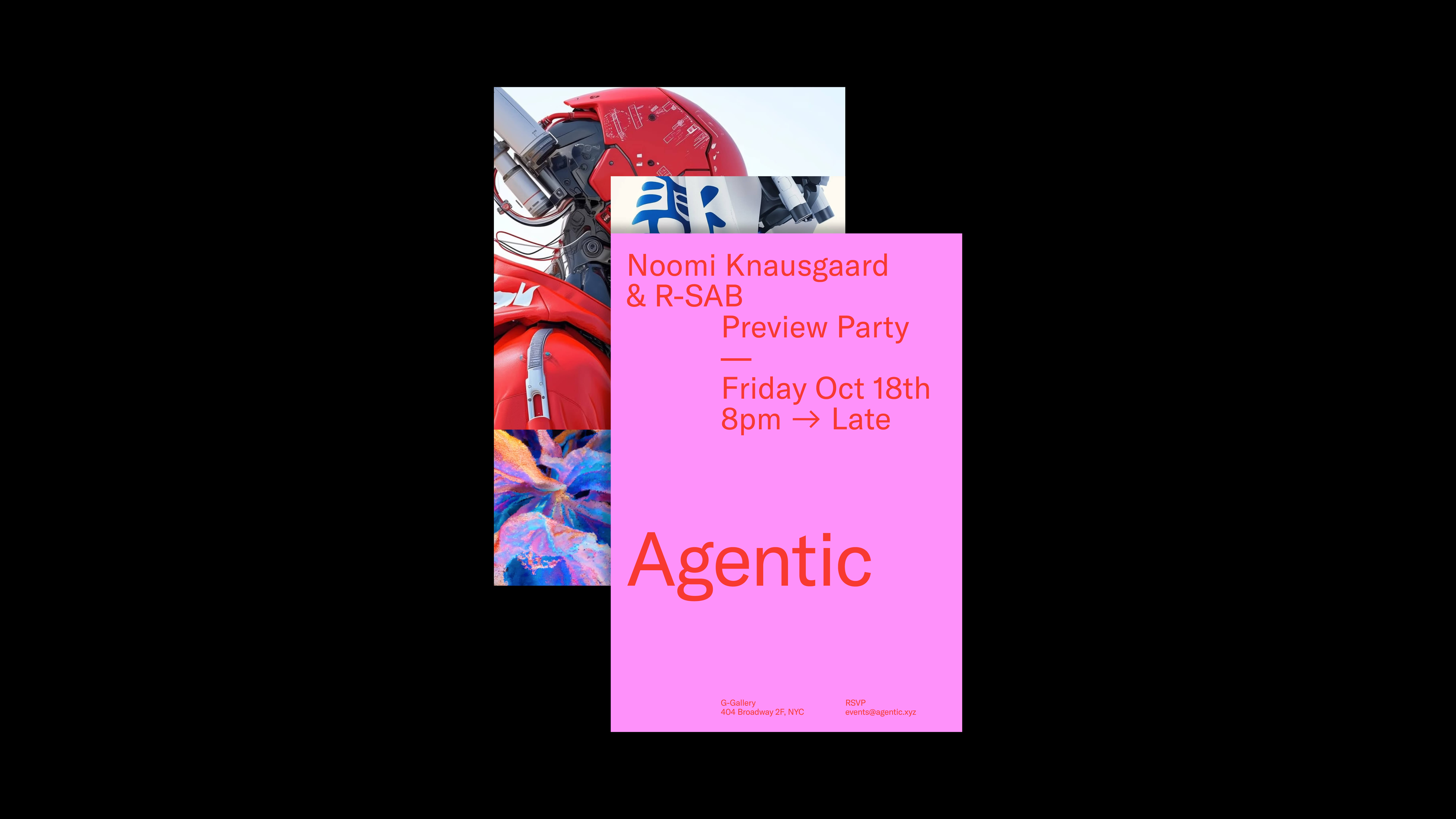
Communications
Agentic is a Web3 gallery dedicated to elevating NFT art and connecting digital creators with a global audience of collectors, institutions, and cultural pioneers. They sought a brand identity that would hold its own beside the world’s leading art institutions whilst clearly signalling its intention to upend industry norms.
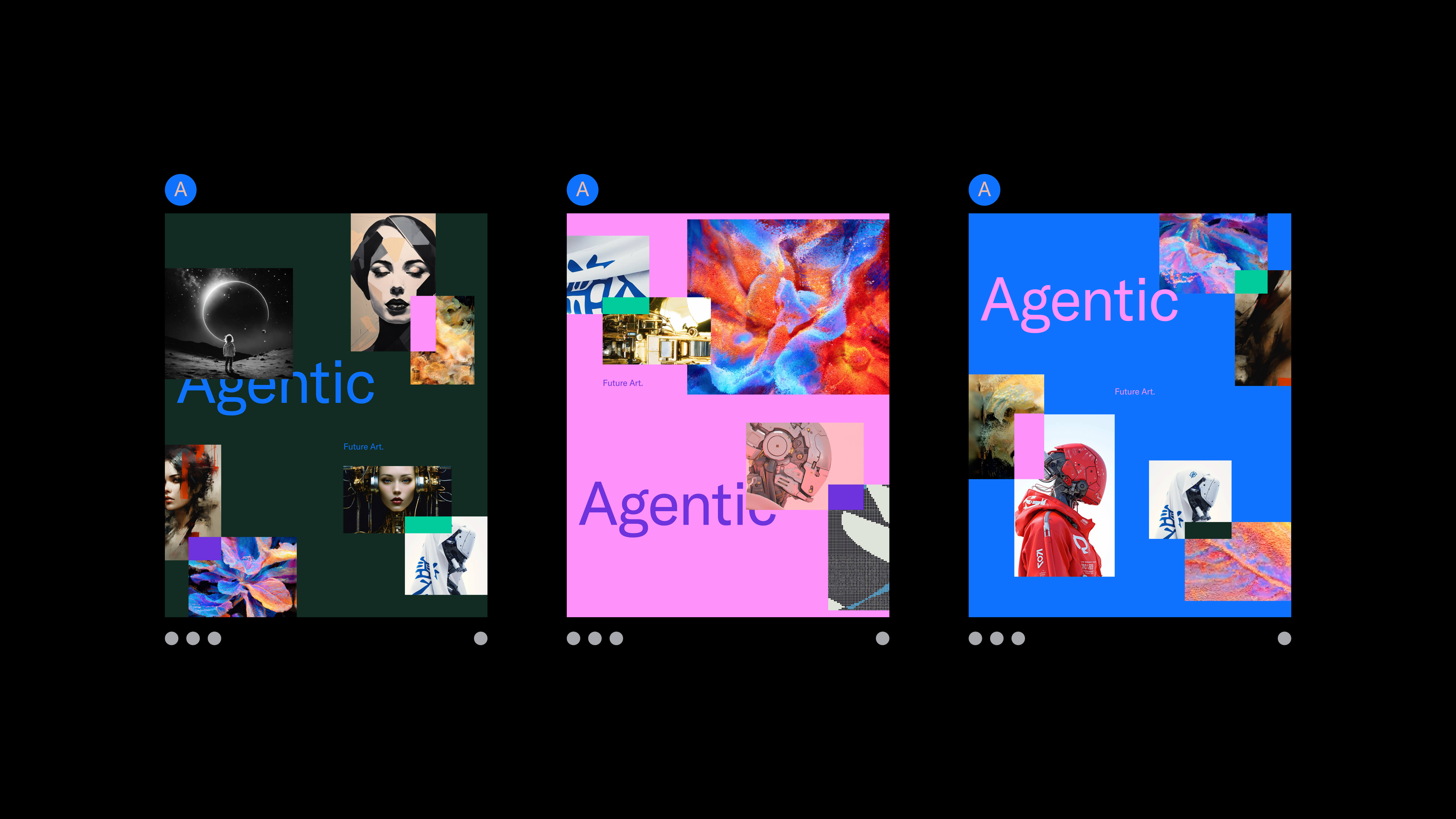
Taking the minimal, type-led approach of traditional museums as its starting point, this identity subverts the status quo through its brash, disruptive colour palette.


The dot element of the identity sits in the bottom right hand corner of each asset, representing both the "sold" sticker from traditional galleries as well as the now-ubiquitous "AI dot" that seems to magically render text and image. This intentional conflation of symbols from the two worlds of tradition and disruption acts as a subliminal signal of Agentic's intention: iconoclasm.


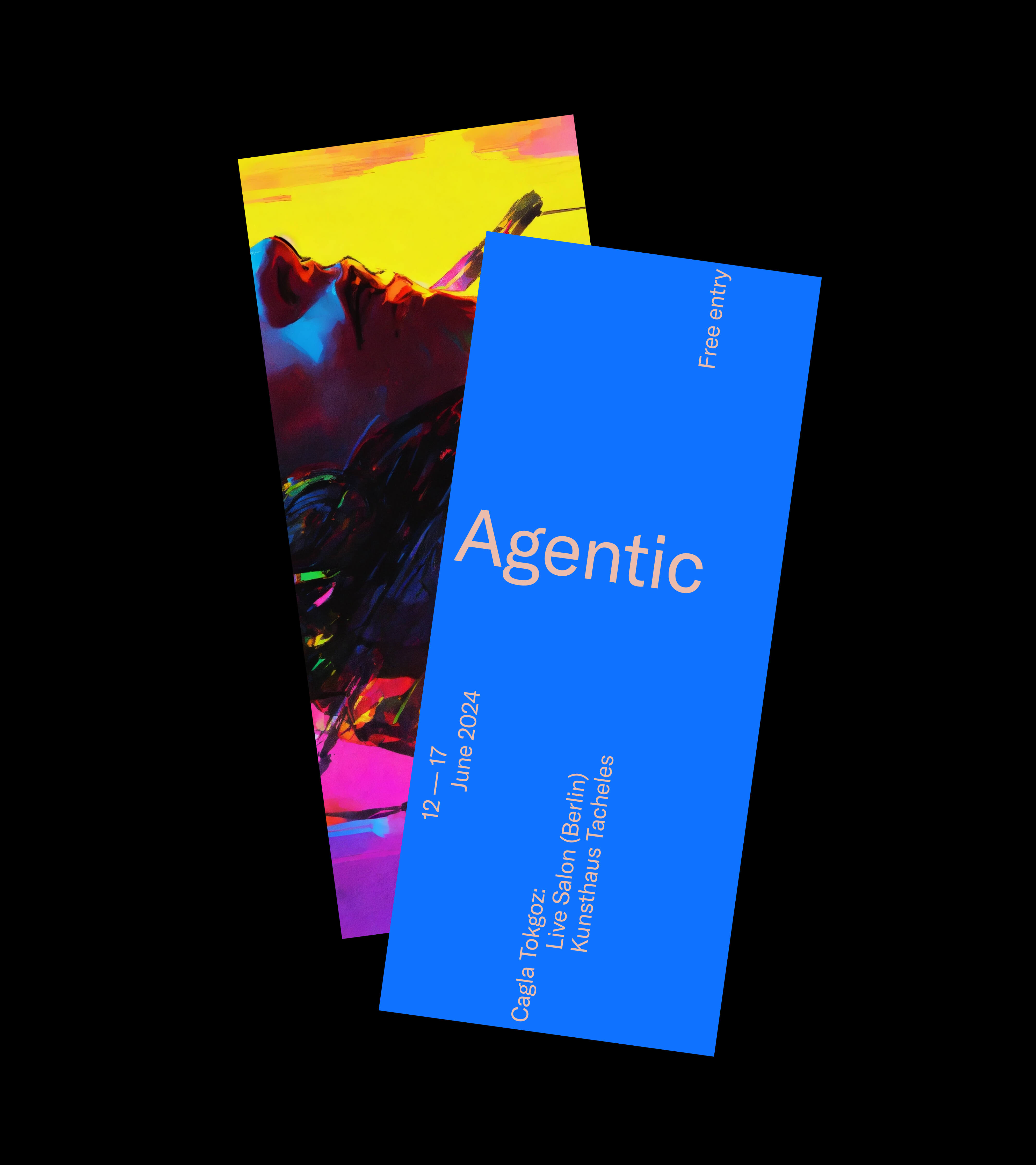
Typography serves as the backbone of the visual identity. The use of just a single weight of GT America across all brand communications ensures clarity, consistency, and a strong curatorial voice. Its neutral tone provides a necessary counterpoint to the expressive colour system, allowing Agentic to speak with authority while still embracing the vibrancy of digital art culture.
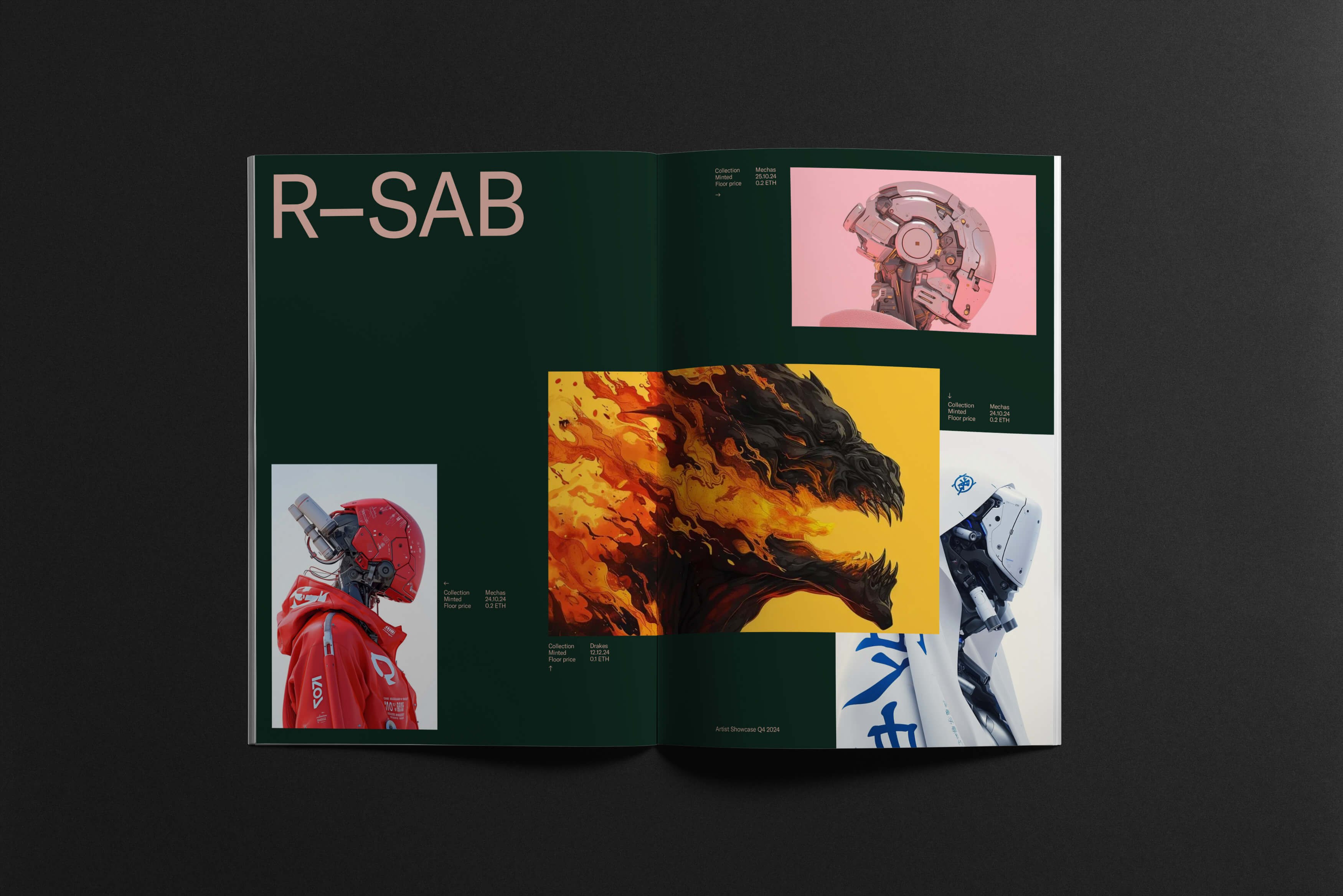
The unmistakeable vivid colour palette ties the identity together across its varied manifestations; connecting printed and digital matter. The result is an identity that feels both credible and boldly contemporary; a sublimation and evolution of the museum aesthetic, not an imitation of it.
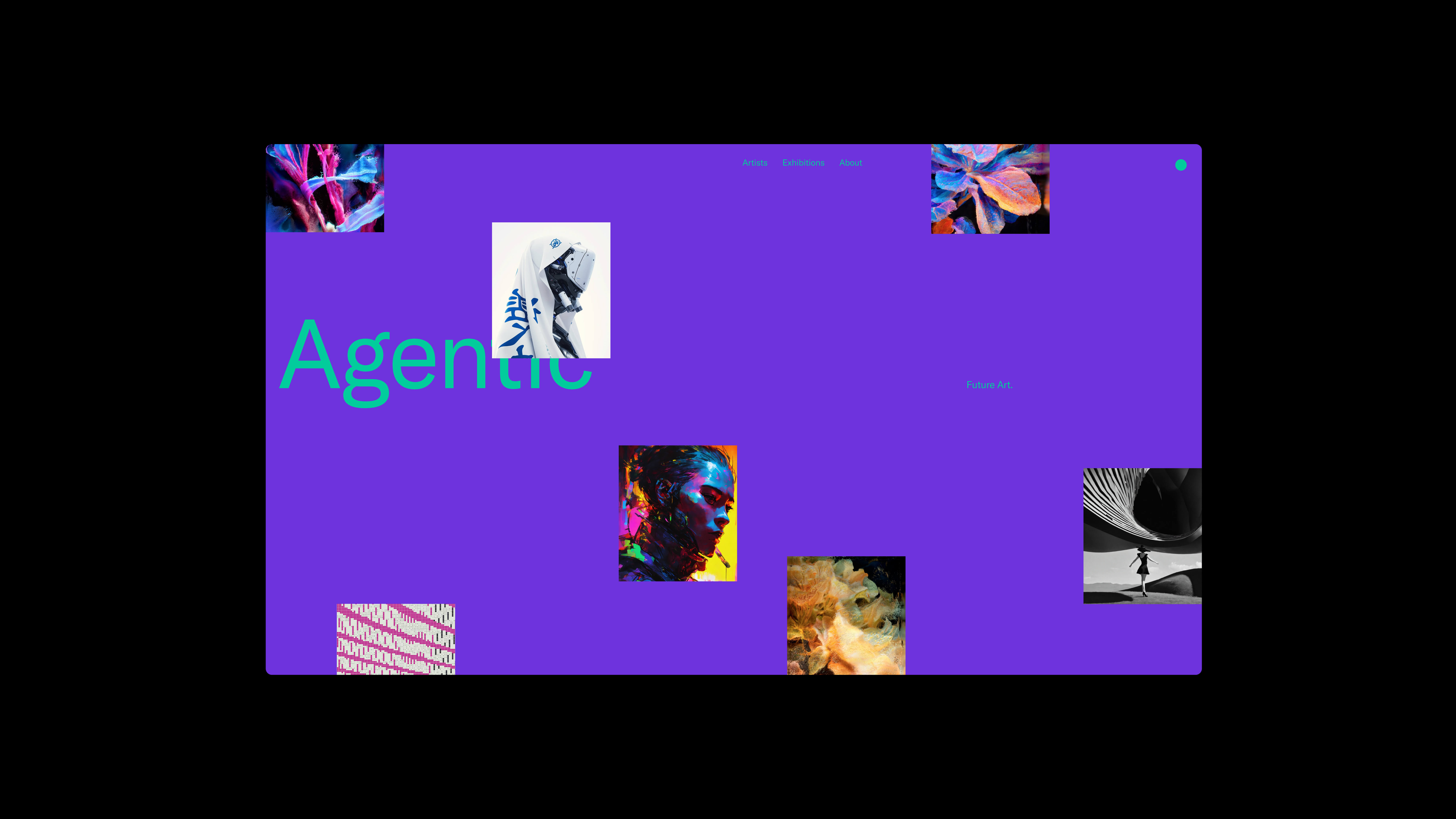
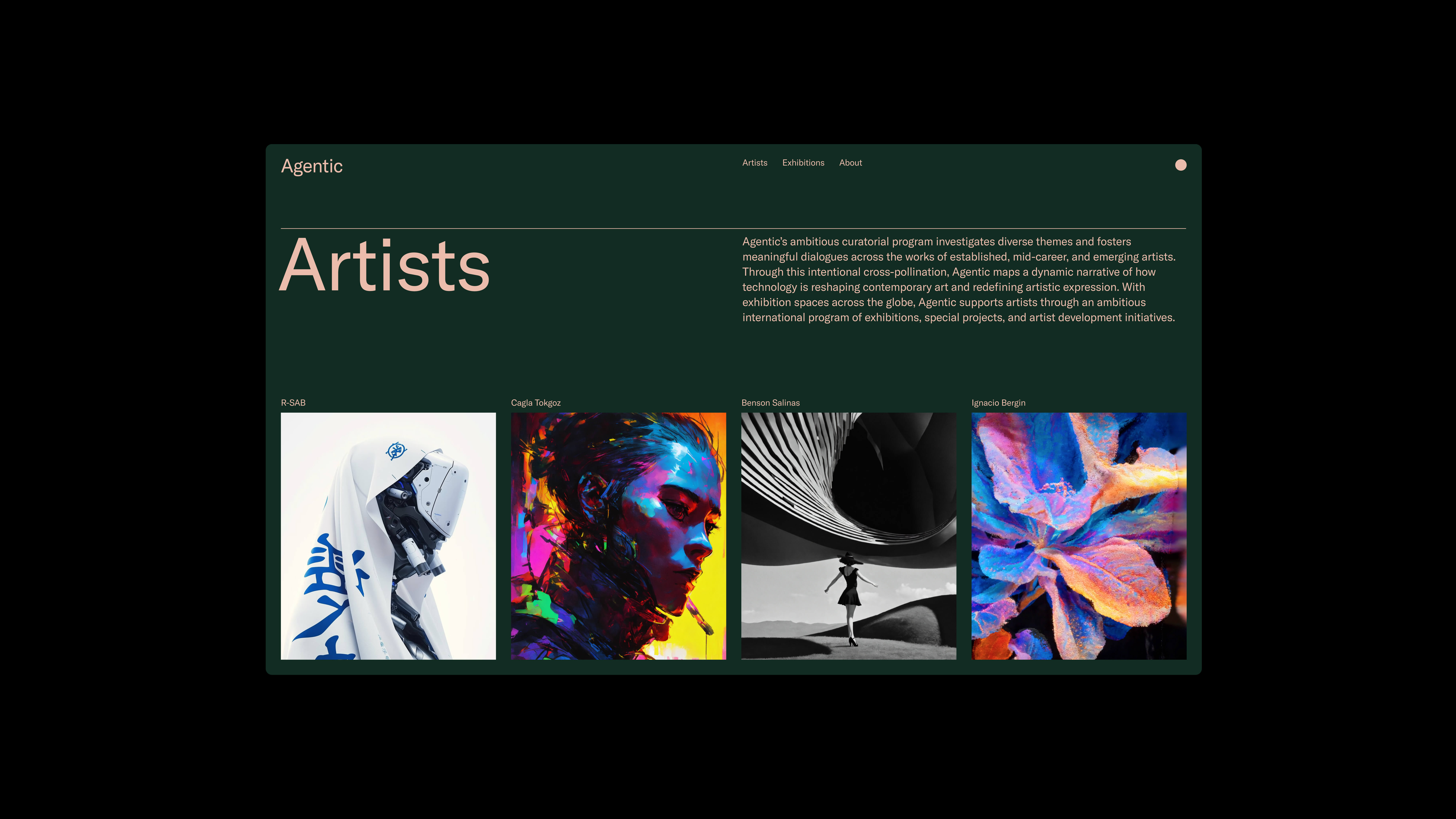
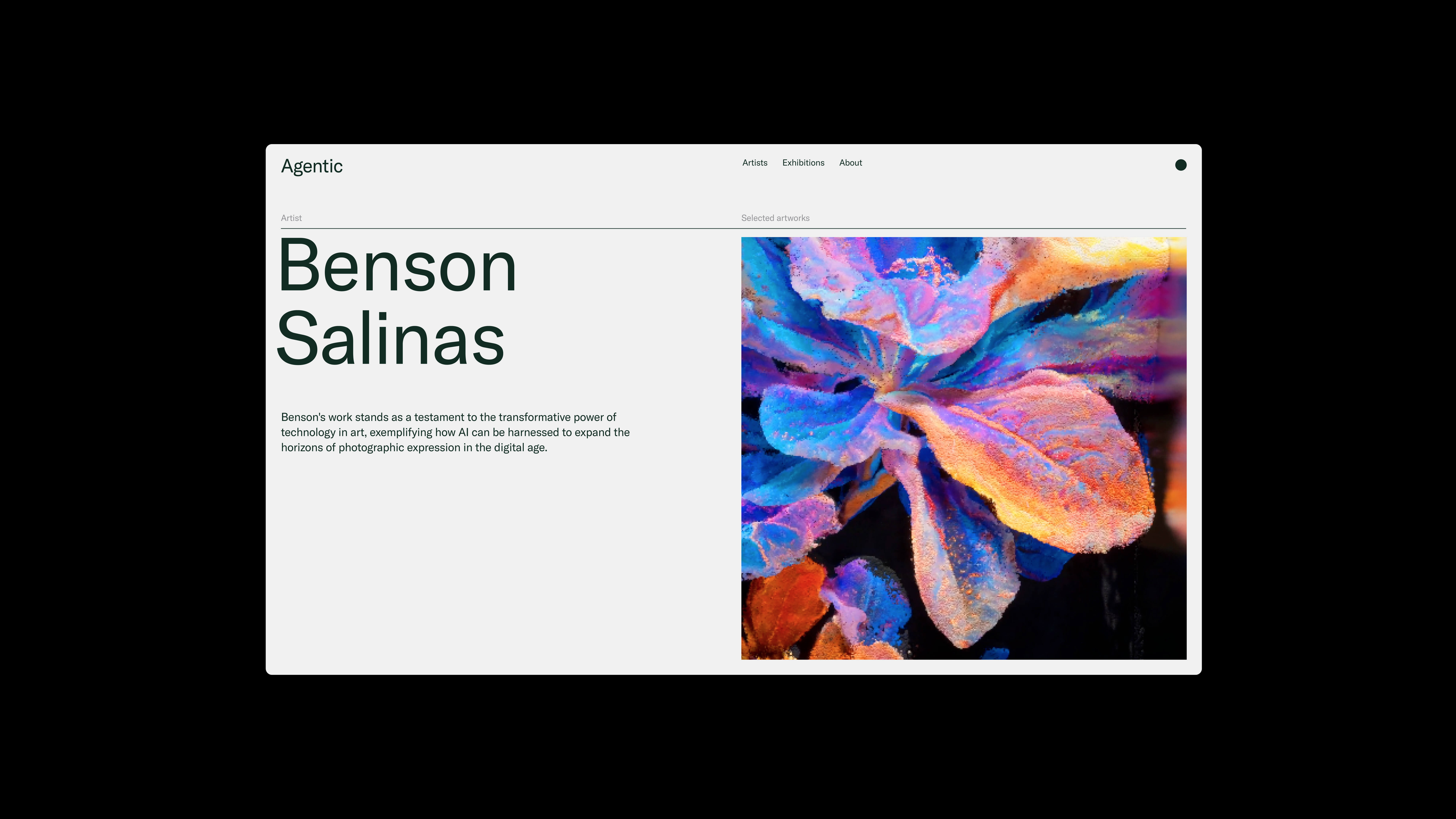
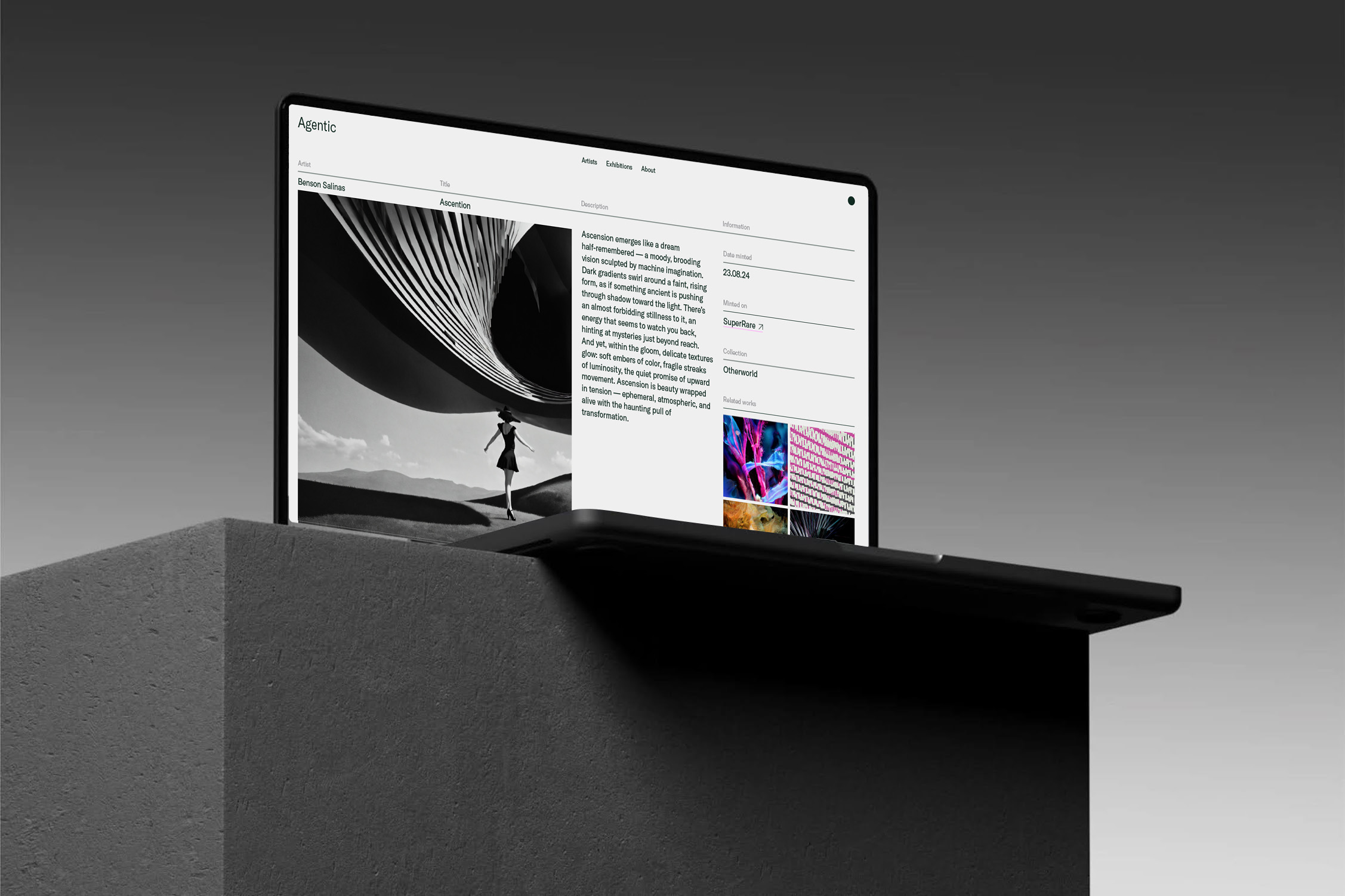
Agentic’s identity reflects the platform’s mission: to elevate NFT artists, expand their audiences, and contribute meaningfully to the next chapter of digital culture. It is a brand built for an art world in flux.

Credits
Designed at Freelance
Fonts:
GT America by Grilli Type
Related Work

